
[vc_row][vc_column][vc_column_text css=””]
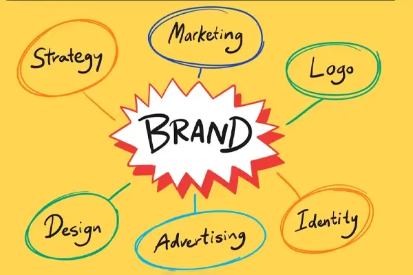
Your brand identity isn’t just a logo or a color scheme it’s the visual soul of your business. When done right, it creates recognition, trust and connection. But even one small design misstep can make your brand look unprofessional or forgettable.
Here are 7 common design mistakes businesses often make and how they silently sabotage your brand’s impact.
-
Inconsistent Branding Across Platforms
One day your logo is centered, the next it’s cropped. Your Instagram posts use one font, but your website uses another. Sound familiar?
Why it hurts: Inconsistency confuses your audience. It weakens your brand recognition and signals a lack of professionalism.
Fix it: Create a consistent style across all brand assets social media, email headers, packaging, pitch decks, everything.

-
Outdated Logos and Color Palettes
If your logo hasn’t been touched since 2010, it’s probably not doing you any favors in 2025.
Why it hurts: Outdated visuals can make your brand feel irrelevant or out of touch with modern audiences.
Fix it: Refresh your logo and color palette every few years to stay modern while preserving brand familiarity. Use tools like Adobe Color Trends to stay updated.
-
Poor Font Choices
Using Comic Sans in 2025? Big mistake. Fonts speak volumes about your brand personality.
Why it hurts: Hard-to-read or outdated fonts create friction and reduce credibility.
Fix it: Choose fonts that align with your brand tone modern, elegant, bold, etc. Keep it readable across all devices.
-
Cluttered and Overdesigned Visuals
More isn’t always better. Crowded layouts, too many icons or five different colors in one graphic? That’s visual noise.
Why it hurts: Clutter overwhelms users and dilutes your message.
Fix it: Embrace white space, use a limited color palette and design with hierarchy in mind to guide the viewer’s attention.
-
No Defined Brand Guidelines
Do your designers, marketers and freelancers all use different versions of your logo? That’s a red flag.
Why it hurts: Without a unified guideline, your branding becomes inconsistent and misaligned across teams and platforms.
Fix it: Create a comprehensive brand style guide with details on logos, colors, fonts, tone of voice and image usage.
-
Ignoring User Experience (UX)
Even great designs fail when the user journey isn’t considered. Is your navigation clunky? Are your CTAs buried?
Why it hurts: Bad UX leads to frustration and drops your engagement rates.
Fix it: Design with your customer journey in mind. Keep it simple, intuitive and mobile-friendly.
At Dezinic, we help businesses in the Pakistan, UAE, Canada and the USA turn ideas into impactful digital experiences. From custom websites and SEO strategies to branding, design and ads management, our services are built to fuel growth and visibility. Explore our portfolio to see real results, browse our services to find the right fit for your business or check out our FAQ’s for quick answers.
If you have any questions regarding “Design Mistakes” feel free to contact us. For inquiries and consultations, call us at: +92 313 4808303 or Email us at: hello@dezinic.dezinicsolutions.com | support@dezinic.dezinicsolutions.com
Disclaimer: The above information is subject to change and represents the views of the author. It is shared for educational purposes only. Readers are advised to use their own judgment and seek specific professional advice before making any decisions. Dezinic is not liable for any actions taken by readers based on the information shared in this article. You may consult with us before using this information for any purpose.
[/vc_column_text][/vc_column][/vc_row]